Monday, September 23, 2013

Mapping Historical Votes: Prohibition Passes The House.

Introduction:

In a previous post, I mapped when women's suffrage failed in the U.S. House in 1915.  For this post, I thought I'd map the (House) passage of the Eighteenth Amendment: Prohibition. 

Here's a link to the vote on Govtrack.  The prohibition amendment was sent to the states by a vote of 282 to 128--a landslide in absolute terms, but relatively close given the margin required to pass a Constitutional amendment.

The 65th House of Representatives was closely divided between Republicans and Democrats.  208 Democrats, 201 Republicans (one "independent"), 3 Progressives, 1 Socialist, and 1 Prohibitionist voted on the Eighteenth Amendment.

Remarkably enough, the major parties split in nearly identical ratios on this issue, with 140 Democrats and 138 Republicans supporting Prohibition, and 64 Democrats and 62 Republicans in opposition. Even the 3 Progressives followed the pattern and split 2-1.

The Map:

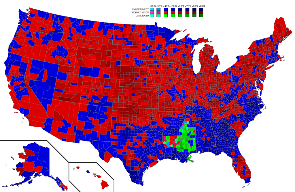
Here's the map.  Once again, I used the historical Congressional shapefiles (by Jeffrey B. Lewis, Brandon Devine, Lincoln Pritcher, and Kenneth Martis), along with Govtrack. 


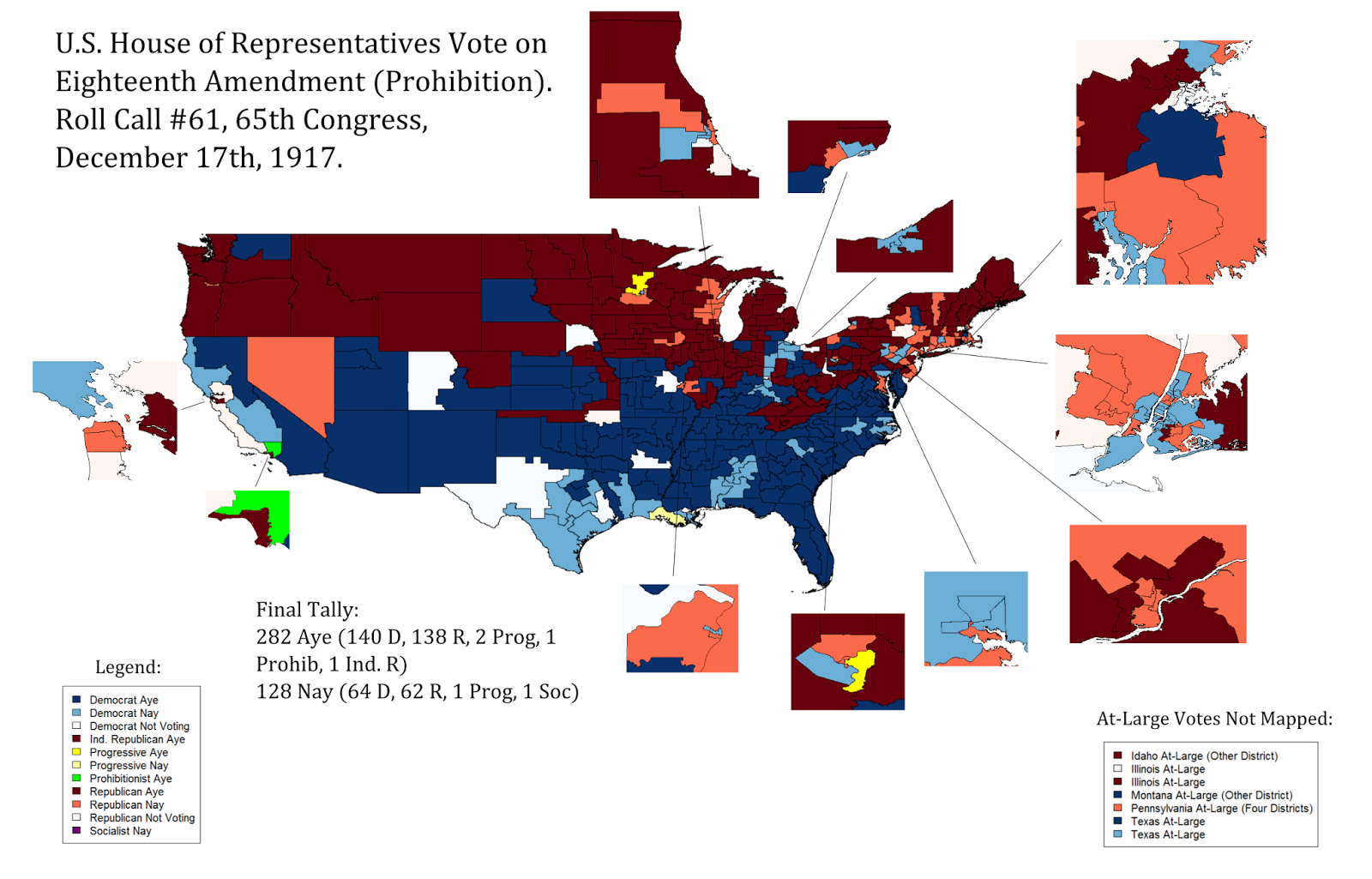
I colored by party as you'd expect (red is Republican, blue is Democratic), with yellow for Progressives.  The darkest color means a vote of "aye", the second-darkest color means a vote of "nay", and the third-darkest color means a vote was recorded as missing or wasn't recorded at all, or there was a vacancy in a district that didn't change parties.

I also used green for the sole Prohibitionist, outer Los Angeles County's Charles Randall, and purple or something for the sole Socialist, Meyer London, who represented an astonishingly tiny slice of the Lower East Side of Manhattan.  London voted "Nay", and you can probably guess how the Prohibitionist voted on Prohibition.

One immediately useful comparison is this map from an Anti-Saloon League book showing which parts of the country had already gone "dry" by March of 1917, before the vote on the Eighteenth Amendment:


Let's take a closer look at a few regions.

The Cities:

Again following Martis' maps, I've added insets for urban areas.  This is particularly useful here, because we can easily see the extent to which Prohibition was a "city-country" vote.

Of the Representatives of the very largest cities, only a very few backed Prohibition:

-The sole New York City Congressman to support Prohibition was Brooklyn Republican Frederick Rowe, whose district included Borough Park.  Go figure.  NY-14 has no vote listed, but it was represented by a notoriously anti-Prohibition Republican: Fiorello La Guardia, who was presumably over in Italy on his WWI missions.

-The Anti-Saloon league listed IL-10 Republican George E. Foss as a resident of Chicago, and he voted for Prohibition.  A 1912 article in Collier's Magazine describes the district as "Lake County and four precincts of the city of Chicago", but Lake County wasn't very big in 1917.

-The four central Philadelphia districts opposed Prohibition, but two peripheral Philadelphia Representatives, Peter Costello and George Darrow, supported the amendment.

-Pittsburgh-area Progressive Melville Kelly supported Prohibition as well, although I'm not sure how much of Pittsburgh proper he represented.  The Anti-Saloon League has him as a resident of Braddock, Pennsylvania.

-Although Los Angeles would soon be named one of the 10 largest cities in the country by the Census, its delegation (downtown Republican Henry Osborne and the aforementioned Prohibitionist Randall) unanimously backed the Eighteenth.

-Minneapolis Congressman, and future Senator, Ernest Lundeen supported Prohibition, even though Minneapolis' Hennepin County had remained "wet" under the local option (although the Anti-Saloon League claimed fraud).

Past that, Prohibition supporters are a bit easier to find: Indianapolis, Rochester, Denver, Columbus, and Oakland districts supported Prohibition, although Jersey City, Portland, Toledo, Providence, Louisville, and St. Paul districts opposed it.  (For some reason none of the Boston Representatives have a vote listed, nor does Seattle's WA-01.  I'm not sure which Rhode Island districts included which parts of Providence proper.)

The South:

Will Rogers famously said "The South will vote dry, at least as many as can stagger to the polls".  Or at least I've seen versions of that quote attributed to him.  Much of the South had already enacted statewide Prohibition, as the above map shows.  But I was more intrigued by how many Southerners voted against the Eighteenth Amendment, although the region was still strongly in favor of Prohibition overall.

Many of the "wet" Southern districts were on the Gulf Coast, including all of coastal Louisiana, most of coastal Texas, and a bit of Alabama.  Southern Louisiana had remained "wet" under the local option.  (One notable Texan who voted against Prohibition was future Vice-President John Nance Garner, who was apparently pretty open in his defiance of the law.)

It's particularly interesting how many Alabama Representatives voted against Prohibition, since the state had already voted "dry".  In fact, 5 of Alabama's 10 Representatives voted against the Amendment, from the coast to Birmingham.

Oddly, the Encyclopedia of Albama describes one of these "No" votes, Birmingham's George Huddleston, as a "champion of...Prohibition".  But Huddleston himself said "I believe in Prohibition, but I can not vote to force it on communities remote from my own, of which I have no specific knowledge and in which I have no particular interest".  J. Thomas Heflin bragged that his district was already "dry as a covered bridge" (in fact, earlier than the rest of the state) and that this was precisely why he opposed the federal amendment.  On the day of the vote, TX-14 Democrat James Slayden proclaimed Prohibition "the overturning and revolutionizing of the Federal Union and the destruction of the States".

Of course, it's hard to separate genuine libertarian inclinations with the darker reasons some Southerners might have feared a bill increasing the power of the Federal government.

North Carolina Democrat Edward Pou probably made the implicit fears of some of his colleagues explicit when he warned that if a Prohibition amendment could pass, then so might an amendment "to prescribe the qualification of voters in all the...states of the union".

Aside from Pou, South Carolina's Frederick Dominick and North Carolina's John Small also opposed the Eighteenth.  So did three Kentuckians: Arthur Rouse, James Cantrill, and Joseph Sherley.  I imagine alcohol was a larger part of the culture and economy of Kentucky than in other Southern and border states (after seeing the map, a friend pointed out that one of their districts included Bourbon County).  Their districts were also relatively urbanized: Sherley represented Louisville, Cantrill's district included Lexington, and Rouse's district was adjacent to Cincinnati and its significant German-American population (see below).

If I remember V.O. Key's "Southern Politics" correctly, the divide in Southern states over "moral issues" was often between their more urban, coastal, and commercial areas (which tended to support laxer policies and often had larger African-American percentages) and their whiter, more rural areas (which tended to support more restrictive policies).

The divisions in Alabama and Louisiana might fit that pattern here, although they only cover some of Alabama's "black belt".  Interestingly, the specific example that I remember from Key is Mississippi, whose House delegation was unanimously "dry".

German-American Regions:

I've read historians who point out connections between the Prohibition movement and nativism--alcohol being a larger part of the cultures and even religious ceremonies of Irish, Italian, and  German immigrants than of the (official) culture of "old stock" Protestants and so forth.  And of course, urban "machines" surely liked their taverns and saloons, although I'm sure many of them learned to love Prohibition even more.

Here is Wikipedia on where German-Americans were concentrated.  Compare with the vote map:

The cities of Milwaukee, Cincinnati, St. Louis, Chicago, New York, and Baltimore were favored destinations of German immigrants. Also, the Northern Kentucky area was a favored destination. By 1900, the populations of the cities of Cleveland, Milwaukee, Hoboken, and Cincinnati were all more than 40% German American. Dubuque and Davenport, Iowa had even larger proportions, as did Omaha, Nebraska, where the proportion of German Americans was 57% in 1910. In many other Northern cities, such as Fort Wayne, Indiana, German Americans were at least 30% of the population.[24][36] Many concentrations acquired distinctive names suggesting their heritage, such as the "Over-the-Rhine" district in Cincinnati and "German Village" in Columbus, Ohio.[37]
A favorite destination was Milwaukee, known as "the German Athens". Radical Germans trained in politics in the old country dominated the city's Socialists. Skilled workers dominated many crafts, while entrepreneurs created the brewing industry; the most famous brands included Pabst, Schlitz, Miller, and Blatz.[38]
Whereas half of German immigrants settled in cities, the other half established farms in the Midwest. From Ohio to the Plains states, a heavy presence persists in rural areas into the 21st century.[19][39] Few Germans settled in the Deep South, apart from some in New Orleans.[40]

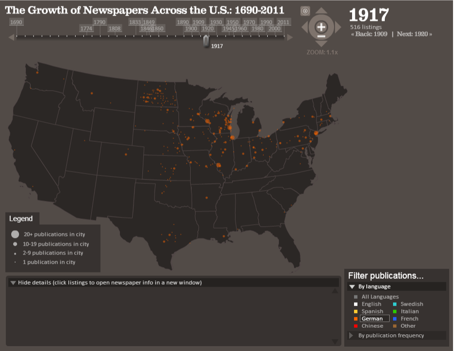
To back that up, here is a Stanford visualization of German-language newspapers in 1917:


And here is a lovely map of the German-American population of about 1872 from that Wikipedia page:


There isn't a perfect correspondence, but there's enough to be interesting.  Along with some of the big cities we've already discussed, the eastern border of Wisconsin (up from Milwaukee), the Western border of Ohio (up from Cincinnati), the St. Louis area, Northern Kentucky, Erie, Pennsylvania--all seem to have had high percentages of German-Americans, and all had Representatives voting against Prohibition.  (The votes in Rhode Island's three districts seem to match pretty well with the 1872 map.)

The sole Iowa vote against Prohibition came from Harry Hull, whose district included Davenport's Scott county, and who succeeded another anti-Prohibition Congressman, the former Davenport Mayor and "archetypal German-American politician" Henry Vollmer.

However, there are exceptions: Omaha was heavily German-American, and the Representative of the Omaha district, Charles Lobeck, was himself German-American.  Lobeck voted for the Eighteenth anyway.  The entire Indiana delegation voted for Prohibition as well.

The West: 

Representatives from the West voted heavily "dry", and much of the West was dry before the vote on the Eighteenth.  California wasn't dry, but did have this depressing law:


Only a few Western Representatives opposed the Eighteenth amendment, including three urbanites (Portland's Clifton McArthur and the San Francisco Republicans Julius Kahn and John Nolan).

California Democrat Clarence Lea had a sound parochial reason for his vote against total Prohibition: He represented California's wine country.  In fact, citing "conditions that affect my district", he proposed an amendment on the day of the vote "exempting light wines and beers containing not more than 3 per cent. of alcohol".

The other Westerners opposing Prohibition were the Central Valley Democrat, Denver Church, and Nevada's Edwin Roberts.  (Nevada remained mostly "wet" before the vote.)  Roberts was eventually elected the Mayor of Reno, where he remained defiantly anti-Prohibition, once claiming in a speech "that the only way to deal with bootlegging was to 'place a barrel of whiskey with a dipper in it on every corner.'"

One notable Westerner voting for the Eighteenth was Montana At-Large Republican Jeannette Rankin.  (Montana also had an At-Large Democrat voting "dry", John Evans, but I decided to map Rankin for her historical importance.)

Wednesday, August 21, 2013

County-Level Poverty Rates in the 1959 United States

I'm not the biggest fan of county-level maps, but I happened to find these Census spreadsheets showing 1959 poverty rates by county (from the 1960 Census).  I used these amazing historical county shapefiles from the Newberry Library's Atlas of Historical County Boundaries.  Here's the poverty thresholds they're using (a pretty complicated topic), and here's the map:


(For some reason, the spreadsheet has two different entries for tiny Weston County, Wyoming.  I just picked the one with the larger population; the other entry would give it a poverty rate of 1.88% out of a population of less than 400.)

This is more about map-making than demographics, but the South practically requires a different color scale than the rest of the country.  The darkest two colors I used correspond to poverty rates of at least 37%.  The following states have a majority of their counties in that category: Virginia, Texas, Florida, West Virginia, North Carolina, Kentucky, Louisiana, South Carolina, Tennessee, Georgia, Alabama, Arkansas, and Mississippi.  That is, nearly every state that could reasonably be called "Southern" (except Oklahoma and Missouri).

Of course, there's a bias here, as the South also has lots and lots of counties.  Of those states, Florida had the lowest statewide poverty rate (28.36%), then comes Oklahoma (29.87%), New Mexico (29.88%), South Dakota (30.1%), and then the rest of the South, with Mississippi's poverty rate the highest, a whopping 54.51%.

Adding to this bias: Many of the most populous (that is, urban) counties in the South had relatively low poverty rates.  Looking at the map, you'll see that the counties of Houston, Dallas, Fort Worth, Baton Rouge, New Orleans, Greensboro, Winston-Salem, Charlotte, Miami, Louisville, Memphis, Nashville, Jacksonville, Sarasota, St. Petersburg, Orlando, Jackson, Little Rock, Atlanta, and the Atlanta suburbs all had among the lowest poverty rates in their states.  (Although West Texas had pretty low poverty as well.)  Same with the counties of Tulsa and Oklahoma City, and with the (arguably less "Southern") Virginia suburbs of D.C.

Probably not coincidentally, many of these relatively low-poverty urban counties were among the first areas of Republican strength in the South.  Nixon, for example, carried a few in the 1960 election, and some also elected Republicans to the 1961-1963 House: there was William C. Cramer in the Pinellas/Hillsborough area, Joel Broyhill in what we now call NoVa, Bruce Alger in Dallas County, Page Belcher, whose district included Tulsa County, Charles Jonas, whose district included Mecklenburg County, North Carolina (Charlotte), and, stretching the definition of the "South", Thomas Curtis, in part of St. Louis County.  (The other Southern Republicans represented districts closer to Appalachia, traditionally less Democratic, such as Richard Poff in Virginia, Eugene Siler in Southeast Kentucky, and the Reeces and Howard Baker, Sr. in Eastern Tennessee.  There was also Durwad Hall, in Southwest Missouri)  Democrats had close elections in a few Southern districts that didn't fit this pattern, though.

I don't know whether the cities themselves were lower-poverty, or whether the inner suburbs in those counties outweighed urban poverty.  Perhaps both.  Richmond City had a relatively high poverty rate of 28.91% (though this was still a bit lower than Virginia's statewide poverty rate of 30.63%), while its inner suburban counties, Henrico and Chesterfield, had far lower poverty rates, 8.04% and 12.66% respectively.

Either way, this was a national pattern.  Many of the poorest counties outside of the South were in rural parts of Minnesota, Nebraska, Michigan, and the Dakotas.  The poorest counties in California (other than tiny Alpine, and Imperial) were in the Central Valley.  The poorest county in Michigan was Lake County, subject of a study of rural poverty a few years later.  (The study pointed out that, at the time, Lake County had the second-highest African-American percentage in the state, apparently because of "land promoters...spreading [a] false rumor" about a Ford plant.  It also alludes to Lake County having been home to the segregation-era African-American resort at Idlewild.)

Of the 100 largest counties in the country, only 18 had poverty rates above the national rate of 22.1%.  Most of these were Southern counties whose poverty rates were probably still lower than their regions'.  Here are the 18, with counties outside the South in bold:

1. Bexar County, Texas (34.8%).
2. Shelby County, Tennessee (33.03%).
3. Mobile County, Alabama (32.02%).
4. Orleans Parish, Louisiana (31.29%).
5. Jefferson County, Alabama (30.87%).
6. Fulton County, Georgia (29.17%).
7. Hillsborough County, Florida (27.97%).
8. Duval County, Florida (26.28%).
9. Davidson County, Tennessee (25.93%).
10. St. Louis City, Missouri (24.62%).
11. Pinellas County, Florida (24.54%).
12. Broward County, Florida (24.07%).
13. New York County, New York (24.06%).
14. Fresno County, California (23.93%).
15. Luzerne County, Pennsylvania (23.25%).
16. Baltimore City, Maryland (23.19%).
17. Dade County, Florida (22.29%).
18. District of Columbia (22.22%).

The aggregate poverty rate in the 100 largest counties was only 14.8% (out of a population, at least the population where poverty could be determined, of about 78,000,000, or about 44.7% of the total).

One exception probably stands out for modern readers: New York County, a.k.a. Manhattan.

Manhattan had the highest poverty rate in the Five Boroughs, about five points higher than the runner-up, Kings County, a.k.a. Brooklyn (17.19%).  Bronx County had a similar poverty rate (16.6%), and Richmond (Staten Island) and Queens counties both had poverty rates below 10% (9.24% and 8.05%, respectively).   Probably a large fraction of Manhattan poverty was concentrated in Harlem.

The list of lowest-poverty counties probably won't surprise any modern readers, except perhaps by how little has changed.  The lowest-poverty counties of 1959 are mostly in still-affluent areas of the country, like the suburbs of New York in Long Island, Connecticut, and New Jersey; the suburbs of D.C., the San Francisco Bay Area, Greater Boston, and even the (briefly notorious) suburbs of Milwaukee.

Here is a list of the 25 lowest-poverty counties of 1959:

1. Yellowstone National Park, Montana (0%).
2. Los Alamos County. New Mexico (2.16%).
3. Nassau County, New York (5.29%).
4. Falls Church City, Virginia (5.34%).
5. Bergen County, New Jersey (5.38%).
6. Du Page County, Illinois (5.48%).
7. Mineral County, Montana (6.28%).
8. Montgomery County, Maryland (6.29%).
9. Morris County, New Jersey (6.58%).
10. Arlington County, Virginia (6.68%).
11. Johnson County, Kansas (6.7%).
12. Anoka County, Minnesota (6.79%).
13. Montgomery County, Pennsylvania (6.86%).
14. St. Louis County, Missouri (6.88%).
15. Hinsdale County, Colorado (6.94%).
16. Fairfax County, Virginia (7%).
17. San Mateo County, California (7.02%).
18. Lake County, Ohio (7.21%).
19. Norfolk County, Massachusetts (7.28%).
20. Baltimore County, Maryland (7.29%).
21. Somerset County, New Jersey (7.36%).
22. Union County, New Jersey (7.53%).
23. Middlesex County, Massachusetts (7.68%).
24. Ozaukee County, Wisconsin (7.8%).
25. Waukesha County, Wisconsin (7.9%).

How does this compare to today?  As I'm reading now, the definition of the poverty rate has changed over time, especially considered in context of changes in anti-poverty programs:

"We used to measure those who were poor after we’d helped them. Now, by and large, we’re measuring who would be poor if we didn’t help them. These just aren’t the same thing and so the numbers are not directly comparable."

As another friend pointed out, this might effect some areas more than others.  As that article says, you can't really make direct comparisons, but I think relative comparisons (these two places used to have similar poverty rates under the 1960 definition, what are their poverty rates now?) remain somewhat interesting.

Because I'm not exactly sure how the definition of the poverty rate has changed over the past half-century, rather than include a map of current poverty rates by county, I'll include this scatterplot of past and present (or 2007-2011) poverty rates for counties with the same FIPS code as in 1960 (plus Miami-Dade).

I don't know if these all have the exact same boundaries, but since Miami-Dade changed its FIPS code when all they did was change the county's name, they should.  A few counties have changed their boundaries since the 1960 numbers (know where Ormsby County is)?


Hm, that's a lot.  Let's limit ourselves to just counties large enough to have 1-year estimates.


Still pretty hard to read--how about the 350 largest of those?


What stands out?  Some counties weren't especially high-poverty in 1960, but are especially high-poverty now: Wayne and Ingham Counties, Michigan; The Bronx and Brooklyn in New York; Clayton County, Georgia; Suffolk County, Massachusetts; Lucas and Lane Counties, Ohio; Champaign County, Illinois; Butte County, California, etc.

(To paraphrase my friend jncca, the correlation with changing racial demographics must be considerable.)

On the other hand, several counties are especially low-poverty now, but weren't in 1959: Loudon County, Virginia; Williamson, Collin, Fort Bend, and Denton Counties, Texas; Cherokee County, Georgia; Union County, North Carolina; Frederick County, Maryland; Seminole, Clay and Sarasota Counties, Florida; Rutherford County, Tennnessee, etc; Shelby County, Alabama; Forsyth County, Georgia, etc.

Three Texas counties on the Mexico border, Hidalgo, Cameron, and Webb, were and remain the poorest of this group of large counties.

If you have any sense of how any of this has more to do with the definition of the poverty rate than with poverty itself, let me know.

Thursday, July 18, 2013

Mapping Historical Votes: When Women's Suffrage Failed, 1915.

With the release of the amazing new historical Congressional shapefiles (by Jeffrey B. Lewis, Brandon Devine, Lincoln Pritcher, and the invaluable Congressional geographer Kenneth Martis), along with the great work of sites like Govtrack, we can fairly easily map any historical vote.

I thought I'd demonstrate this with a vote that has long interested me: the failed vote on a women's suffrage amendment in the 63rd Congress (1913-1915).  

Here's the map, colored by party as you'd expect (red is Republican, blue is Democratic), with yellow for Progressives, and green for the sole independent, California's William Kent (who may or may not have been a Progressive for this vote).  Following Martis' maps, I've added insets for urban areas.
  
The darkest colors are "aye", the lighter colors are "nay", and the lightest colors are unrecorded votes ("Not Voting", vacancies, or not listed by Govtrack at all).


Note that this was before "one man one vote", so quite a few states had one or more at-large Representatives.  Since these can't all be mapped, I've listed those votes on the bottom right.

Some regional patterns are immediately clear:
  • The South, and Southern Democrats more specifically, was almost monolithic in its opposition to the suffrage amendment.  Of "Deep South" Congressmen, only Alabama's Richmond Hobson voted Aye (although he had lost a primary for his next term already).

    Even in border states, most of the Aye votes came from Republicans in Eastern Tennessee, Western Virginia, Kentucky, and West Virginia.  I believe the only exceptions are the two Memphis-area Democrats, future Senator Kenneth McKellar and Thetus Sims.
  • The West--Democrats, Republicans, Independents, and Progressives--was even more monolithic in its support of the suffrage amendment.  Only one Western Congressman, Colorado Democrat George Kindel, voted against the suffrage amendment, and there were scarcely even any missed votes.  Many of these states, of course, already allowed women to vote.

    (Incidentally, the two Los Angeles County Congressmen, Charles Bell and future Governor William Stephens, identified as Progressives at points in their careers, but GovTrack has them listed as Republicans for this vote.  Bell, who incidentally helped pass California's suffrage act, had been re-elected as a Progressive, but this was still his "Republican" term.  You might notice California's partisan geography is the inverse of today's, with coastal districts Republican or independent, and inland districts Democratic).

    Oddly enough, Kindel had retired from the House to run for Senate--on the "Kindel Commercial Equality" ticket.  He wound up behind the Socialist, with 4.5% of the vote.

  • Cities were generally against the suffrage amendment, although there are some nuances:
    • The Congressmen from New York City, Detroit, Cleveland, St. Louis, Detroit, Baltimore, Milwaukee, Newark, Cincinnati, Indianapolis, Rochester, Columbus, and St. Paul were nearly all against suffrage.  They were also nearly all Democrats.  By the way, note the incredible number of districts mostly or entirely on Manhattan--about 12.

      The two Manhattan Congressmen who voted Aye were Progressive Walter Chandler and Democrat Henry George Jr., the son of the famous "Single Tax" advocate.  Both had Harlem-area disricts, with George's extending into the Bronx.  Brooklyn's Herman Metz (another lame duck) and James Maher (representing what we now think of as Downtown Brooklyn) supported the amendment as well.

      Cleveland Democrat Robert Crosser voted for the suffrage amendment as an at-Large Representative from Ohio, and Baltimore Democrat Frank Smith (a lame duck by the time of this vote) also supported the amendment.  And of course, the representatives from Southern cities (New Orleans and Louisville were the largest urban areas in the South at the time) opposed women's suffrage as well.
    • Congressmen from Philadelphia, Boston, Pittsburgh, Buffalo, and Providence were split (Boston was only split in the sense that the central Boston Congressmen don't seem to have voted at all).

      I find Philadelphia's split particularly interesting, with Broad Street serving as the apparent dividing line.  Broadly speaking, my sense (from, e.g., the great book "Tasting Freedom") is that Western Philadelphia has generally had more "reform" politicians, and Eastern Philadelphia has generally had more "machine" politicians, although archetypal Philly machine boss William Vare voted for this amendment.  Incidentally, the city's sole anti-suffrage Republican, J. Hampton Moore, would go on to be Mayor.

      I also don't know what on Earth is going on with Providence, which might be split into as many as three districts, but Rhode Island Democrat George O'Shaunessy supported the suffrage amendment.
    • Congressmen from Chicago, Minneapolis, Kansas City, Jersey City, and most Western cities (Los Angeles, San Francisco, Seattle, Portland) recorded no votes against the amendment.

      Toledo Democrat Isaac Sherwood (a Civil War veteran!) voted for the amendment, and the aforementioned George Kindel was a Denver Democrat.

      I don't know why the representatives of the entire urban area between Newark and New York City voted for suffrage when neither of those cities did themselves.

      New Haven (lame duck) Democrat Thomas Reilly voted for the suffrage amendment as well.

As I understand the scholarship, urban voters (often immigrants) and/or urban machines were often hesitant to support women's suffrage for various reasons, and perhaps especially since they feared women would vote for prohibition.  (Some writers note that women's suffrage passed relatively easily once prohibition was enacted anyway).  I don't remember which papers I'm thinking of; perhaps this one by Buenker.  Anyway, this might be part of why the representatives from northern Wisconsin and Minnesota's Iron Range opposed this suffrage amendment as well.  

With cities and the South mostly opposed, it's pretty amazing that even a third of the Democratic caucus supported this suffrage amendment.  Some political context:

You might have noticed I kept writing the phrase "lame duck".  

Democrats won the 1912 House elections in a landslide, winning 290 seats (which is.  But they lost a net total of 60 seats in the 1914 elections, keeping the House but with a greatly reduced majority.  Connecticut, for example, went from all-Democratic to all-Republican in the 1914 election, and Democrats lost 10 seats in Illinois.  

Between that enormous loss, primaries, and retirements, a great many lame ducks were voting on this amendment, so the relationship between the roll call vote and district-level public opinion on women's suffrage was probably pretty complicated.  It would be interesting to study that further.

But my main point in writing this post is to promote the use of these wonderful shapefiles in historical political science.

By the way, along with the maps, I found this PDF directory of the 63rd Congress useful in checking which Representatives lived in which cities.

Friday, July 5, 2013

Where Has New York City Changed In The Last 10 Years?

In my last two posts, I looked at demographic changes in Brooklyn, as measured by the U.S. Census or by the American Community Survey. My conclusion was that, despite some apparent misconceptions, relatively little of Brooklyn is "gentrifying"--that is, growing wealthier, whiter, and more educated.

With the same technique—using tract relationship files to combine 2000 and 2010 tracts into comparable units (throwing out currently empty polygons)--we can look at changes across New York City.  Have any neighborhoods changed like Brooklyn's Williamsburg/Park Slope nexus?  And what other kinds of changes have their been?

(By the way, I found these neighborhood maps of Queens and the Bronx useful, among others.)

Let's begin with race and ethnicity. Unfortunately, New York City is quite segregated, and with de facto racial/ethnic borders that are very close to what they were 10 years ago.  For example, the boundary of Chinatown, in lower Manhattan, is almost precisely the same in 2000 and in 2010.


While most areas have seen rather little racial or ethnic change, some areas have of course seen much more.  On a map, changing regions stand out all the more for being relatively rare and sharply limited.  

For example, here is a map of the change in non-Hispanic white population share (“blue” generally means “decrease”, in these maps):


The non-Hispanic white population share generally increased the most in that familiar Brooklyn region running from Gowanus through Prospect Heights and Williamsburg to East Bushwick. 

There was some increase in Harlem, especially in South Harlem, in Hudson Yards, and in Battery Park, and what seems to be a smaller increase in Astoria and in Coney Island.  But if you step back a bit from the map, then the Prospect Heights area should stand out as the most significant.

Several areas of New York City had shrinking non-Hispanic white population shares.  It might be tempting to construct a single narrative or explanation to try to explain all of these areas--"this is where minorities are being pushed by gentrification", or whatever.  But the areas are all pretty different.  Some became less white because they became more African-American, others became more Asian, others became more Hispanic.  And the same applies to the areas that became more white.  I'm not sure how much a single story fits.

(You also might have noticed a strip of midtown Manhattan, around Penn Station, that wouldn't fit this narrative either.) 

For example, southeast Brooklyn—Canarsie—saw an increase in African-American population share, while Brooklyn's Prospect Heights, Manhattan's Harlem, and Queens' Rochdale and Jamaica neighborhoods saw decreases.  I don't know how many African-American residents simply moved from Harlem or from Prospect Heights to Canarsie, but I wouldn't discount the effects of people moving to and from New York City altogether.  Indeed, South Jamaica's Wikipedia entry claims that "increasing numbers of Mexican and West Indian immigrants [have moved] into the community in recent decades.


On the other hand, southwest Brooklyn—Bensonhurt and Sunset Park--saw an increase in Asian-American population share, as did Ozone Park and most of northwest Queens.  Very, very few Census tracts had declining Asian-American population shares, and I don't think all of this can be explained by displaced Battery Parkers.


The Bronx, Lindenwood, Woodhaven, and Richmond Hill, Queens, and much of North Shore, Staten Island, north Harlem saw increases in Hispanic percentage share, while Williamsburg and Bushwick saw decreases.  The Bronx's Community District 10--Throgs Neck and so on, along the Eastern edge--was 48.4% non-Hispanic white and 26.6% Hispanic in 2000, and now (or in 2010) it's 34.5% white and 36.6% Hispanic.


Back to the original question: Now that we know which neighborhoods in New York City grew whiter, we can ask which neighborhoods grew wealthier and more educated.  (There might be some oddness with these maps because of "missing" ACS data--it's less comprehensive than the full Census.)

Here is “bachelor's degree-holding New York City”, then and now:


The lines have stayed relatively constant, but there are notably increases, especially in Williamsburg, Astoria, and Harlem.  Looking at the change map provides further evidence:


Harlem, Astoria, Prospect Heights, Gowanus, Red Hook, Williamsburg, East Shore Staten Island, and Riverdale all show marked increases in the percentage of residents over 25 with at least a bachelor's degree.  But again, step back a bit from the map, and Williamsburg/Prospect Heights, Astoria, and Harlem stand out the most, at least to me.  A lot of people claim the South Bronx is gentrifying, or is about to gentrify, and I suppose there are a few tracts that might support that, but I don't think the South Bronx would stand out to me if I wasn't looking for it.

Few areas show marked decrease—again, the county as a whole has become more educated--although "outer" Brooklyn, Queens, and the Bronx (outside of Riverdale) stand out to me.

Finally, let's look at median household income.  The map of New York City's money stayed pretty stable, with Williamsburg perhaps the clearest visual exception:


Unlike the above statistics, median household income can't really be meaningfully compared by aggregating population, but here is the change map for comparable Census tracts, with incomprable Census tracts colored grey.
While not every tract is comparable, enough tracts are comparable in enough neighborhoods that I think you can see the overall trends.  And, once again, Williamsburg and Park Slope stand out, as does midtown Manhattan (some of which, as you recall, is actually less white than it used to be).

Hopefully, I've provided enough information that you can come to your own conclusions.  But here are three of mine:

First, New York City's obviously had a lot of change in the past decade or so.  But in many regards, what hasn't changed is as significant as what has.  The lines of education, ethnicity, and income  have shown little change in many cases.  

Second, Prospect Heights has indeed gotten whiter, Astoria and Harlem have indeed gotten more educated, and Williamsburg and Park Slope have indeed gotten wealthier.  But the Brooklyn neighborhoods, collectively, stand out, and I think the nature and extent of their change really is unique citywide.

Third, there are many other neighborhoods that saw many other interesting changes.  I'm still curious about that stretch of Midtown, for example.
  
One final map:  

A much under-appreciated fact about New York City, I think, is that (according to the ACS) nearly half of New Yorkers aren't speaking English at home. And, like with many other characteristics, there are sharp regional divides that, in many ways, show little change:


Note that, if you were to overlap the “English-Speaking” map with the “non-Hispanic white” map, you would see that relatively few New York City Census tracts are both generally white and generally English-speaking. (Basically, many of the English-speaking neighborhoods are heavily African-American.) The exceptions are lower Manhattan (by which I mean everything south of Harlem, outside of Chinatown), Williamsburg, Park Slope, and Staten Island. Unsurprisingly, these are basically the neighborhoods many white English-speakers (and writers) identify with the city as a whole, with the unsurprising exception of Staten Island. But they are not, to say the least, very representative.

Wednesday, June 12, 2013

Tract by Tract, Brooklyn Still Isn't Park Slope.

My last post looked at demographic changes in Brooklyn at the Community District level.  My claim was that, despite a lot of conventional wisdom (and Style section stories), only a few areas of Brooklyn have gotten demonstrably "whiter, better educated, and higher earning" over the past decade.

However, some of the statistics were for approximations called "PUMAs" rather than for the districts themselves.  These are basically the "official" approximations, but I thought I would look at the Census tract level to make sure there weren't any discrepancies.  

Unfortunately, only five year estimates are currently available for Census tracts, presumably because of the smaller sample sizes, compared to the three year estimates available for the PUMAs.

The statistics I'd like to check are median household income (MHI) and the percent of residents over 25 with at least a bachelor's degree.  Income support and non-Hispanic white percentage were, I think, both calculated for the current Community District boundaries.

Where did Brooklyn's earnings increase?  Mostly, in a few areas clustered around Park Slope and Williamsburg, Census tracts suggest:


To make sure, let's make a map of the changes, at least where we can.  The Census bureau has relationship files and I removed all polygons with no 2010 population, along with polygons from all 2000 or 2010 tracts that didn't have an income estimate (both colored white below).

Some tracts were still merged, split, or otherwise altered between 2000 and 2010 (those are colored yellow below).  But about 90% of Brooklyn lives in the remaining tracts.

(The precise map you get depends on if you use Summary File 3 or Summary File 4.  The former has a few more tracts with an estimated MHI.  If you use SF3, then there are a few more "incomparable" areas.  Since these tracts didn't have too many people in them, I couldn't decide which made more sense, so I thought I'd include both versions.)


Once again, the Williamsburg and Park Slope areas saw significant increases, and so did some nearby neighborhoods, like a few tracts in Bushwick right next to Williamsburg.

But otherwise, most of Brooklyn's Census tracts had stagnant or decreasing median household incomes (or at least incomes with nominal increase below, or barely above, an estimate of the rate of inflation).

In what will come as a surprise to absolutely no one, the greatest single increase (where I could make a comparison) was in DUMBO's Census tract.  The population tripled, and the median income soared from an already high $99,000 to a ridiculous $168,000.

Where did Brooklyn become better educated?  Recall this was the most notable change across the borough: the percentage of Brooklynites over 25 with at least a bachelor's degree had increased by 8 points from 2000 to 2010 (rather, to the 2007-2011 average).  

Looking by Census tract, we can see, once again, that Williamsburg's character has completely changed, but otherwise, it looks like a relatively stable map, with increases in Downtown Brooklyn, Prospect Heights, and (for some reason) an odd horizontal run in Bed-Stuy.


To make sure, let's make a map of the changes.  This time, I was able to use the Census Bureau's relationship files to combine both sets of tracts into directly comparable "clusters" (once again after removing polygons with no 2010 population).

Here's what the change looked like:
This is probably the best argument that there's been widespread change in Brooklyn.  Over 1,500,000 Brooklynites--about 56% of the borough--live in Census tracts or clusters where the percentage of residents over 25 with at least a bachelor's degree increased by more than 4% (the national change).

Where was the greatest increase?  Tract 203, in Prospect Heights.  Over two-thirds now have at least a bachelor's degree, compared to just 21% in 2000.  The change in median household income wasn't nearly as dramatic, in part because Tract 203 still has a significant low-income population.  It's the only tract in Brooklyn where at least 30% of households report an income under $15,000 and at least 30% of households report an income over $100,000.

(I was briefly worried that there might be more of this kind of discrepancy, but overall, median household income is quite well-correlated with percentage of high-income households, and it's a similar change map.)

Remember, the increase doesn't necessarily come entirely from well-educated new residents driving out less-educated old residents.  Some of it could come from old residents picking up degrees, or whatever it is that drove the national increase.

Finally: Yes, these are estimates.  It's possible that there are recent changes the ACS misses, or that response rates are off, and so on.  (Although the suspicion, as I said, seems to be that the Census is missing Hispanic and immigrant Brooklynites.)  But this approach picks up the areas that everyone agrees have gotten much more upscale, and I don't know what evidence there is that it's missing similar changes elsewhere.

Next up?  I realized that it's not too much harder to make these tract-level comparison maps for the whole city, so I'll be taking a similar look at all of NYC.

Saturday, May 25, 2013

Brooklyn And Park Slope Are Getting Less Alike, Not More.

I spend a lot of time in Brooklyn.   This quote from a New York Times article by Michael Barbaro seems to be typical of the paper's coverage of the borough:
"Increasingly, Brooklyn is starting to look a lot more like [Mayoral candidate Bill] de Blasio and the idyllic, thoroughly gentrified Park Slope neighborhood he calls home: whiter, better educated and higher earning."
My guess, especially after reading the rest of the article, is de Blasio knows better than to use this line campaigning around Brooklyn.  Really, anyone who's taken a long walk in Brooklyn should know better.  But we'll take a look at each of these claims.

Here's a map of Brooklyn's Community Districts:


The Census Bureau (as compiled by researchers at CUNY or as linked to by the city) has various demographic statistics and estimates by Community District (or approximations--"PUMAs"--thereof) for both 2000 and more recently.  

Park Slope is in Brooklyn's Community District 6, along with a few similar neighborhoods like Carroll Gardens.  

Let's start with the claim that Brooklyn has gotten whiter.

In 2000, according to the Census, Brooklyn (Kings County) was 34.7% non-Hispanic white.  In 2010, Brooklyn was...35.7% non-Hispanic white.  (The one-year estimate in 2011: 35.6%.)

But in 2000, District 6 was 54.9% non-Hispanic white--much whiter than Brooklyn.  By 2010, it was 62.7% non-Hispanic white: much, much whiter than Brooklyn.  So Brooklyn (in the aggregate) looks quite a bit less like Park Slope than it did in 2000.

This is even more true of District 1, which contains Williamsburg, the subject of seemingly every third New York Times article.  From 2000 to 2010, District 1 went from 48.0% non-Hispanic white (much whiter than Brooklyn) to 60.8% non-Hispanic white (again, much, much whiter than Brooklyn).

But how is it possible that Brooklyn barely got whiter, while Williamsburg and Park Slope got much whiter?

While it might come as a surprise to some readers of the New York Times, there are in fact other parts of Brooklyn than Williamsburg and Park Slope, and many of them had decreasing white populations, increasing nonwhite populations, or both.  But for our current purposes, let's just look at the changes in non-Hispanic White percentage.


Yes, the non-Hispanic white population increased in those Manhattan-adjacent Community Districts.  But the non-Hispanic white percentage in the borough barely changed, because there's more going on.

Community District 11 (Bensonhurst and Bath Beach) became narrowly majority-minority as the Asian and Hispanic populations soared.  The African-American population in Community District 18 (Canarsie) increased by over 16,000.  The minority population share in Community District 5 (East New York) went from 94.9% to 96.6%.

These places seem to get far, far less press attention than Williamsburg and Park Slope.  But, as of 2010, they have well over half a million people between them.  The combined population of Districts 5, 11, and 18 is 22.3% of the population of Brooklyn and about the equal to the population of Albuquerque, New Mexico.

Has Brooklyn gotten higher earning? 


Kind of. In 2011, the Census estimated the median household in Brooklyn earned $42,752 a year.  In 1999 the Census estimated the median household income in Brooklyn was...$42,852 (in 2011 dollars; the listed figure in 1999 dollars is $32,135).  That's compared to a national median household income of $50,502 (in 2011) and $55,999 (in 1999), again using 2011 dollars.  In constant dollars, Brooklyn stagnated while incomes dropped elsewhere.  

What about Park Slope?  The median household income in District 6 went from $66,736 in 2000 to $85,985 in a 2008-2010 two-year estimate (in constant dollars or something close).

This was, as you can see, a far greater increase than anywhere else in the borough--and District 6 already had the highest median household income in Brooklyn.  Many of Brooklyn's Community Districts saw minimal change or even decreasing median household income.

We can also look at income support.  The Community District profiles include the percentage of the population on some form of income support: TANF, SSI, or Medicaid.


From 2005-2011, the percentage of Brooklyn's population on income support actually increased, from 36.9% to 40.9%.

Just like Park Slope!  No.  In Park Slope's District 6, the percentage declined, from 18.9% to just 16%.  Once again: Park Slope's district, already atypical, got even more unlike Brooklyn.  (The percentage also declined in District 1, from 47.1% to 41.9%, although I suppose that's getting closer to Brooklyn's percentage.  Part of the reason Williamsburg has such large percentage increases is that it's starting from a low base in several ways.)


The percentage of the population on income support declined in just six Community Districts out of eighteen: Districts 1, 2, 3, 4, 6, and 8.  

These six districts comprise more or less the area people talk about when they talk about gentrification and so on.  It's basically the same group that had significantly rising median household income and the same group that got significantly whiter. 

But these six districts collectively account for less than 30% of Brooklyn's 2010 population.  More than 70% of Brooklyn lives in a community district where the percentage of people on income support actually increased from 2005-2011.  Maybe that's not surprising, given the recession.  But it's important.

Has Brooklyn gotten better educated?

This probably has the most to it.  In 2000, 21.8% of Brooklyn's 25-and-over population had a bachelor's degree or higher, compared to 24.4% nationally.  By 2011, that was up to 29.9%, compared to 28.5% nationally.  Brooklyn's gone from being a bit less well-educated than the country to a bit more well-educated.

But Park Slope?  Park Slope's District 6 went from 52.5% with a bachelor's degree to 65.3%!  (Again, that's from a 2008-2010 two-year estimate.)


Williamsburg's District 1's percentage doubled, from 18.4% to 36.8%.  Park Slope's district went from much more educated than Brooklyn to much, much more educated, and Williamsburg's district went from a little less educated than Brooklyn to much more educated than Brooklyn.  But in this case, at least, the increase is more well-distributed than in some of the other cases.


We could also look at real estate prices (mostly because I want to have something from a non-Census source).  This is from PropertyShark, via CityLimits, and it shows the increase in residential price per square foot from 2004-2012.

Brooklyn Gentrification Map: Increase, Decrease in Home Values 2004 vs. 2012

Williamsburg's prices increased 174% in 8 years.  This is, to say the least, not representative of Brooklyn. It's nearly three times as large as the percentage increase in any other area.  Community Districts 2 and 6 seem to cover many of the other areas that had large increases.  And large swaths of the borough saw either decrease or stagnation.

I'll end with something positive.  The original quote had two parts.  The second was that Brooklyn, itself, is getting whiter, better educated, and higher earning.  That's...not completely wrong, based on the information I have.  Brooklyn is (a very small amount) whiter, (more significantly) better educated, and (arguably not even) higher earning.

But that still makes it pretty hard to believe the first part of the claim.  The part about how Brooklyn is "increasingly...starting to look a lot more" like Park Slope.  Stagnating borough-wide median income and a 1% increase in non-Hispanic white population isn't enough to turn Brooklyn into Park Slope Large.  (The 8.1% increase in bachelor's degrees might help...if Park Slope hadn't had a 12.1% increase.)

You know the old joke about how when Bill Gates walks into a bar everyone in it is suddenly, on average, a millionaire?  

Park Slope (to use shorthand for the surrounding area) is, itself, getting whiter, better educated, and higher earning.  That's driving some of Brooklyn's aggregate change.  ("In the aggregate, everyone in this bar is now a millionaire!") 

But it means Park Slope is getting farther away from Brooklyn, not closer, because it was already the best-educated and highest-earning part of Brooklyn, and among the whitest.  And (most of) the rest of the borough isn't keeping up with Park Slope's rate of change.

(I recall looking at this article which argued that, similarly, a few Community Districts in lower Manhattan "pulled away" from everywhere else.)

I'll conclude with another map from CityLimits, this (lovely) one showing the poverty rate.
  

Poverty In Brooklyn: A Block by Block Analysis

Wednesday, May 1, 2013

The Palm Beach Puzzle: How did a diversifying urban county trend Republican?


Introduction:

(I like this map, from here.)

After the 2012 election, "demographics are destiny" became a popular phrase.  As the country diversifies, so the story goes, pretty much everywhere will trend Democratic.

There's no denying that many diversifying areas have trended Democratic.  But there are interesting exceptions.  Consider Palm Beach County, Florida.  It diversified, but trended Republican.  Was it because of older people?  Jewish people?  Rich people?  None of the above?  Let's see what we can find out.

Palm Beach County doesn't fit many of the stereotypes of a Republican-trending area.  It isn't Appalachian or (culturally) Southern.  And it's diversifying.  The county's non-Hispanic white population shrank by a full 10% from 2000 to 2010, according to the Census.

In fact, over that period, few Florida counties diversified by as much as Palm Beach County:


But there's an evident Republican trend.

Barack Obama barely improved in Palm Beach County over John Kerry, in 2008.  In 2008, Obama got 61.51% of the (two-party) vote.  In 2004, John Kerry got 60.71% of the vote.

Perhaps Palm Beach County is simply "inelastic".  And it's true that Democrats generally get around 60% in Palm Beach County (then again, Democrats generally get around 50% in Florida, at least in these elections).

But in 2012, Obama got 58.56% of the two-party vote--so he did worse than Kerry, and had a greater decrease than he had nationally, either from 2004-2012 (obviously) or from 2008-2012:


Going back to 2000, Gore (62.3%) and Nader (1.3%) combined to 63.6% of the (overall) vote.

In PVI terms, Palm Beach County has lost about half of the Democratic advantage it had in 2000 and 2004, when it was about D+12.  In 2008, it was D+8, and in 2012, it was less than D+7.

And no, this isn't just about Barack Obama. Compare Bill Nelson's 2006 and 2012 performances by county, or compare Alex Sink's Gubernatorial performance in 2010 with Jim Davis' Gubernatorial performance in 2006.  Nelson declined nearly everywhere from 2006 to 2012, but his decline in Palm Beach County was greater than his statewide decline.  Davis had a solid loss, and Sink nearly won, but Sink actually did a bit worse in Palm Beach County than Davis.

In every case, Palm Beach County trended Republican relative to the state or national swing, whether the Democrat improved overall (2004 vs. 2012 Presidential, 2006 vs. 2010 Gubernatorial) or declined overall (2006 vs. 2012 Senatorial).  In most cases, Palm Beach County trended Republican in absolute terms, too.  (I think the only exception there is Obama's tiny improvement over John Kerry in 2008.)

That's a Republican trend.

The basic partisan geography:

Unfortunately, official Palm Beach County results for the 2004 election don't seem to allocate by precinct, but we can make precinct maps for the 2008 election (using Dave's Redistricting App and Census/TIGER shapefiles) and for the 2012 election (using election results and shapefiles from the Palm Beach County supervisor of elections).

This map shows Obama's performance by precinct in 2008 and Obama's performance by precinct in 2012.


(In both cases, I'm not including a handful of votes attributed to precincts that don't have shapefiles, and the precinct totals for 2008 don't quite sum to the certified total  I don't think  I can only work with what I have.)

There's a lot of information here.  One of my favorite factoids: That single red precinct surrounded by blue is the tiny town of Atlantis, which seems to mostly be a golf course.

But where are the Democratic areas?

First, and unsurprisingly, there are the majority-minority areas.  Let's compare Obama's 2012 performance to the 2010 Census numbers (by 2008 precinct):


There was a high overall correlation between non-Hispanic white population and Obama's performance in 2008 (when we can compare them by precinct using Dave's Redistricting App).


What about that cluster of extremely white precincts where Obama did very well in 2008?

Interestingly, they overlap pretty closely with the oldest Census tracts.  Or, at least, with the largest cluster of Census tracts where a large of the population was 60 or older.  And Obama still did well there in 2012:


This area is King's Point/West Delray Beach, and it's heavily Jewish (see below).


The 2008-2012 Trend, and possible explanations:

Palm Beach County helpfully provides a precinct conversion chart.  Using this chart, I was able to divide Palm Beach County into comparable "clusters" of 2008/2012 precincts, and directly compare Obama's two-party share in the two elections.

The following map shows that comparison:


Obama did better than in 2008 on the shore of Lake Okeechobee and in the Westgate/Palm Springs/Lake Worth Corridor area.

Obama did worse than 2008, often considerably worse, nearly everywhere else.

For example, in the northern part of the county contained in FL-18, currently represented by Democrat Patrick Murphy, Obama received close to his national numbers in 2008, winning the area with about 52.5% of the vote, judging by Dave's Redistricting App.  But in 2012, Obama lost the area, getting 47.6% to Romney's 51.75%, according to the DKE spreadsheet.

Hopefully, this trend map refutes the idea that Palm Beach County is simply "inelastic".

As you can see, there's a stark regional divide.  What explains the Democratic-trending areas?

Let's compare the "trend" maps to various other maps.  Here's the most convincing comparison, to my eyes:


The most Democratic-trending areas are essentially identical with the Hispanic areas, especially the Westgate/Palm Springs/Lake Worth Corridor area.  This area did diversify quite a bit--it's basically the same as House District 87, where the non-Hispanic white population plummeted from 50.9% in 2000 to 29.5% in 2010.  But I don't know how much change happened here from 2008 to 2012.  (And House District 86, to its immediate west, diversified quite a bit as well, but doesn't show the same trend.)

The biggest exception seems to be some of Riviera Beach, where Obama didn't seem to improve all that much relative to the Hispanic areas, and which is majority-African-American.

Without getting into a discussion about the (very real) dangers of ecological analysis, I think it's pretty clear what's going on.

Obama did considerably better among Hispanics, a little better or about the same among African-Americans, and quite a bit worse with non-Hispanic whites.

Again, I can't directly compare 2004 precincts, but there's every reason to think the same was true from 2004-2008, especially at the PVI level.

Another explanation I've heard suggested:  Is this just because old people trended Republican?   Maybe, but compare the trend map with the age map.


It is true that most of the oldest areas trended Republican, but that might just be because they're mostly some of the whitest areas.  And the northern part of Palm Beach County, the part in FL-18, trended Republican, but isn't particularly old, apparently, or at least not all of it.  Also, the heavily-Democratic "oldest" area seems to have trended Republican a bit less than some of the surrounding areas.

Another suggestion was: Is this just because rich people trended Republican?  I think that's a little more likely.  Compare the trend map to this map showing median household income by Census Tract.


All of the majority-minority areas seem to be low-income (sigh), but gradations among higher-income Census tracts seem vaguely associated with gradations in the trend map.  The FL-18 part of the county basically all trended Republican, and it's basically all pretty high-income.  The higher-income parts of South Palm Beach County seem to have trended Republican a bit more than the lower-income parts.

Finally, alas, people have understandably wondered: Is this just because Jewish people trended Republican?

Unfortunately (if understandably), neither the Census nor the American Community Survey keeps track of religion.  However, the Jewish Databank has a study from 2005, with Jewish households by zip code.  


Again, while Jewish areas trended Republican, if anything, it looks to me like some of the most Jewish areas trended less Republican than some of the surrounding areas.  And, once again, an explanation based on Jewish people trending Republican doesn't explain why the FL-18 part of Palm Beach County trended Republican.  But it's entirely possible that, for example, the Jewish areas immediately west of Boca Raton (on the border with Broward County) trended Republican for one reason, and the part of Palm Beach County in FL-18 trended Republican for another reason.

Conclusion:

I can't explain these results just from comparing maps, obviously.  And, as always, I look forward to feedback from people with local or specific knowledge.

But here's what Palm Beach County illustrates: increasing diversity isn't a guarantee of improving Democratic performance.

The assumption behind "demographics is destiny" is that partisan preference will stay constant within an ethnic group.  But, in Palm Beach County, there seems to have been a lot of change within ethnic groups.  Hispanic areas got more Democratic, and white areas got more Republican, from 2008 to 2012.

The 2012 election was more racially polarized, then, and not merely because Democrats improved with nonwhites.  There's every indication that Democratic performance actually declined among non-Hispanic whites.

And the result, in Palm Beach County, was a decline in overall Democratic performance.